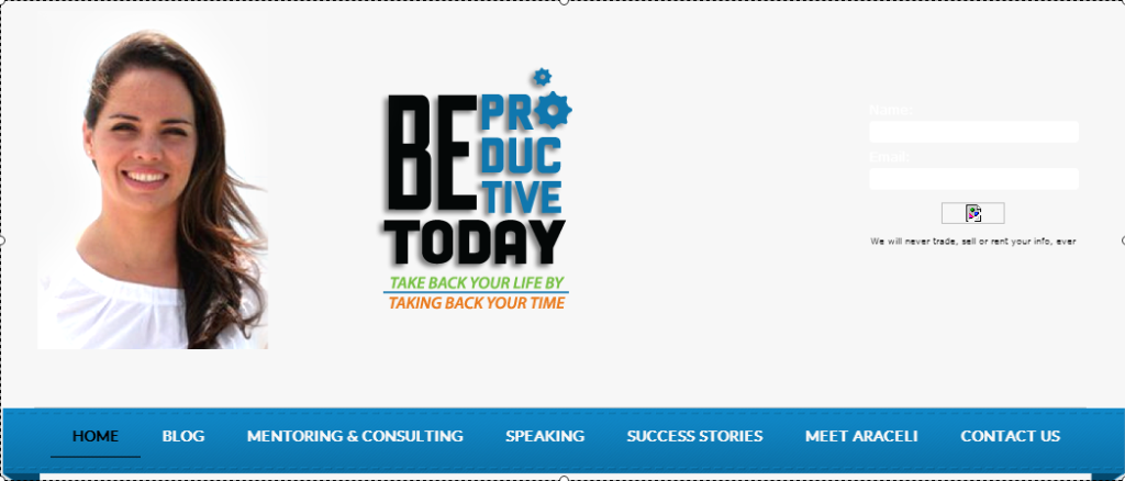
BEFORE
Here is the website header I transformed. Notice…
1. Her picture is beautiful, but it’s out of proportion (ie too big).
2. The logo is too small, and certainly not utilized very effectively.
3. You can hardly see the optin box on the right.
4. The image under the optin is missing.
5. The gray background is very blah and unappealing.
6. The spacing is awkward.
7. It’s too tall – the header takes up too much valuable space on the computer screen
AFTER the transformation…
1. Her picture is proportionate to the other elements.
2. The logo is properly sized for the space.
3. The optin box is eye catching and where you want the eye to go (it does).
4. The image in the optin shows up prominently.
5. The background is colorful and appealing.
6. The spacing of the elements are smooth and balanced.
7. We’ve provided more valuable space on the computer screen for items ‘above the fold’

“Barbara took one look at my website and really understood me. She had a vision for me and my business that I never would have imagined. I really didn’t have to give her anything….she had a vision and ran with it… and I must say that I’m so glad that I went with Barbara, because I just LOVE what she’s done!”
“She is really good at what she does and I couldn’t be happier with the results!”
Araceli Gonzalez
www.BeProductiveToday.com
Productivity Mentor and Business Strategist

